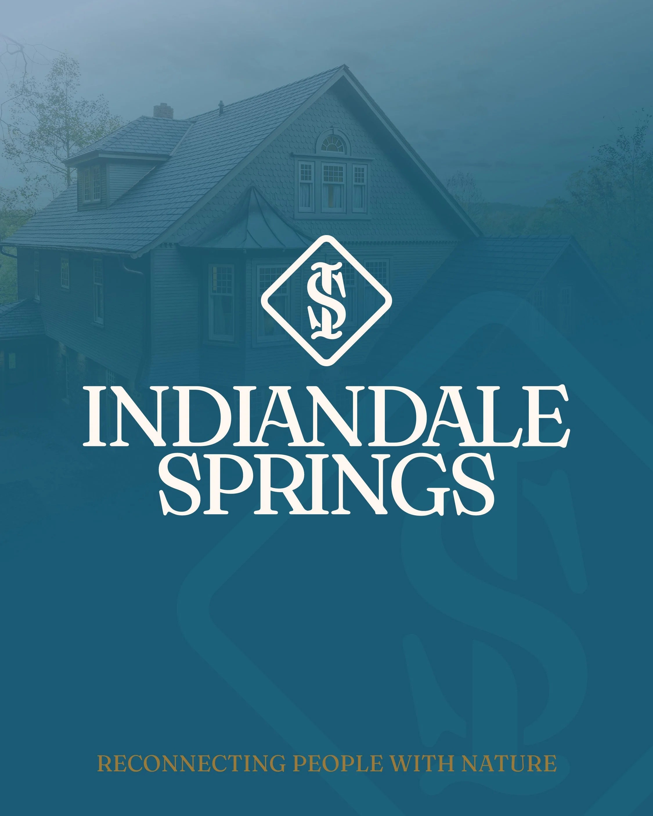
Indiandale Springs
Final Deliverables: Logos including variations | Brand Guidelines
Indiandale Springs was originally a health resort called Vinemont Resort, built in 1885. In 2025, the property was restored and renamed Indiandale Springs. Indiandale Springs operates as a retreat center, short term vacation rental, and wedding venue. This includes a large Victorian estate, a cozy cabin, and a beautiful natural landscape. Guests enjoy access to the pond, pickle ball quarts, and natural spring on the property, providing the perfect atmosphere to reconnect with nature.
As a new business, Indiandale Springs recognized the importance of establishing a cohesive brand from the start. Their challenge? Reaching three distinct audiences – church groups booking the retreat center, extended families seeking vacation rentals, and brides searching for the perfect wedding venue. They needed a brand that could unify these experiences under one elevated identity. As they grow, Indiandale Springs aims to be recognized as a refined, high-end destination.
While we discussed the heart behind their business, one common theme kept surfacing – connection with nature. This insight became the foundation for their tagline and mission, “Reconnecting People with Nature.” Whether it’s a church group, family, or bride and groom, all would have the opportunity to reconnect with nature during their time at Indiandale Springs. This concept became the backbone of the brand strategy and the guiding principle for creative decisions.
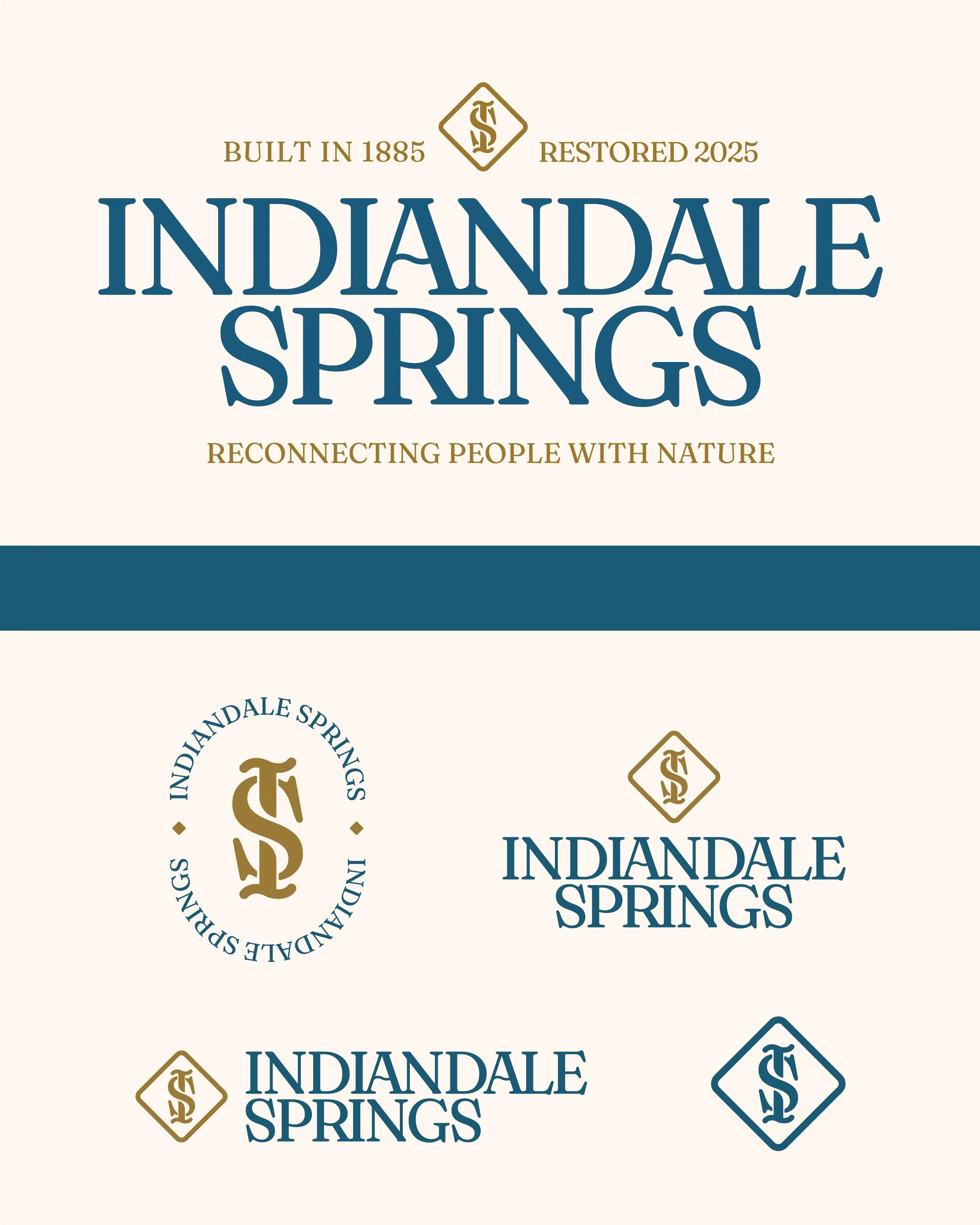
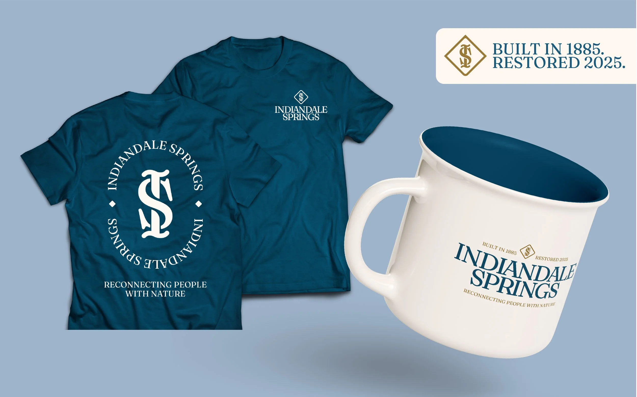
The final identity system features a luxury feel, leaning into the Victorian Style with the monogram icon. The vibrant blue color represents the springs on the property its pairing with the gold further emphasizes the Victorian influence. The diamond shape around the monogram ties in the architecture of the springhouse on the property.