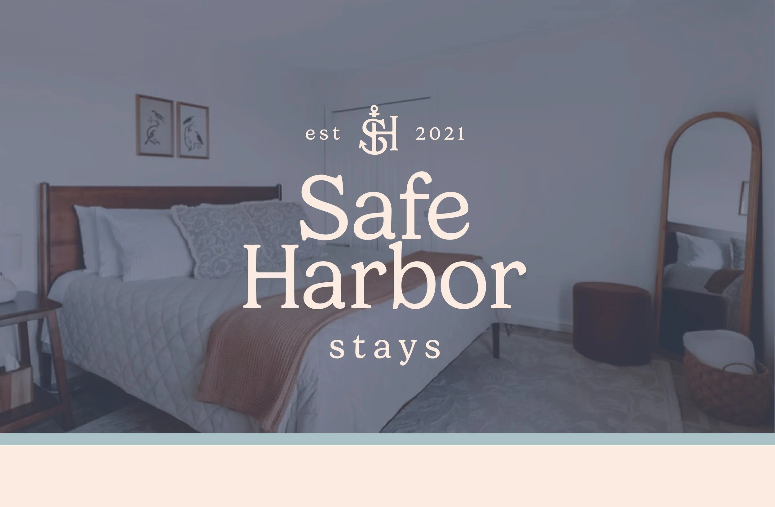
Safe Harbor Stays
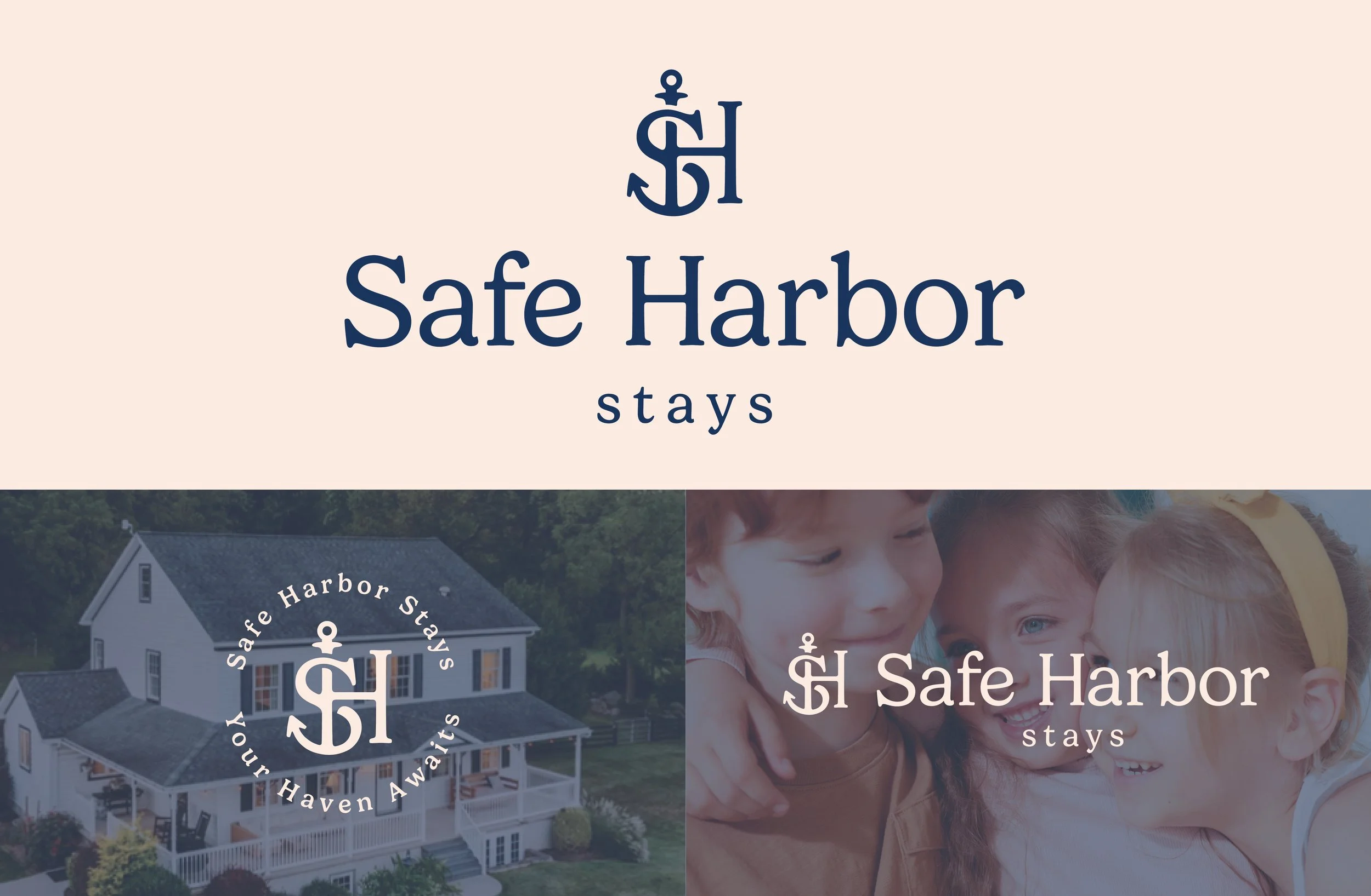
Final Deliverables: Logos including variations | Brand Guidelines
Visionboard Stays began four years ago when founder Juliana co-hosted a single Airbnb that grew organically through word of mouth into a curated portfolio of 28 properties. Built on hospitality, integrity, and attention to detail, the business offers vacation rentals designed to deliver stress-free, elevated experiences with an emphasis on providing unique outdoor features. From intimate guest suites to luxury family stays, each property is intentionally furnished and personally managed, with guests supported by a small, hands-on team who truly know each space. In 2026, Visionboard Stays rebranded to Safe Harbor Stays, continuing to prioritize quality over quantity, creating welcoming, trustworthy, and thoughtfully curated stays that feel personal, well cared for, and quietly distinctive.
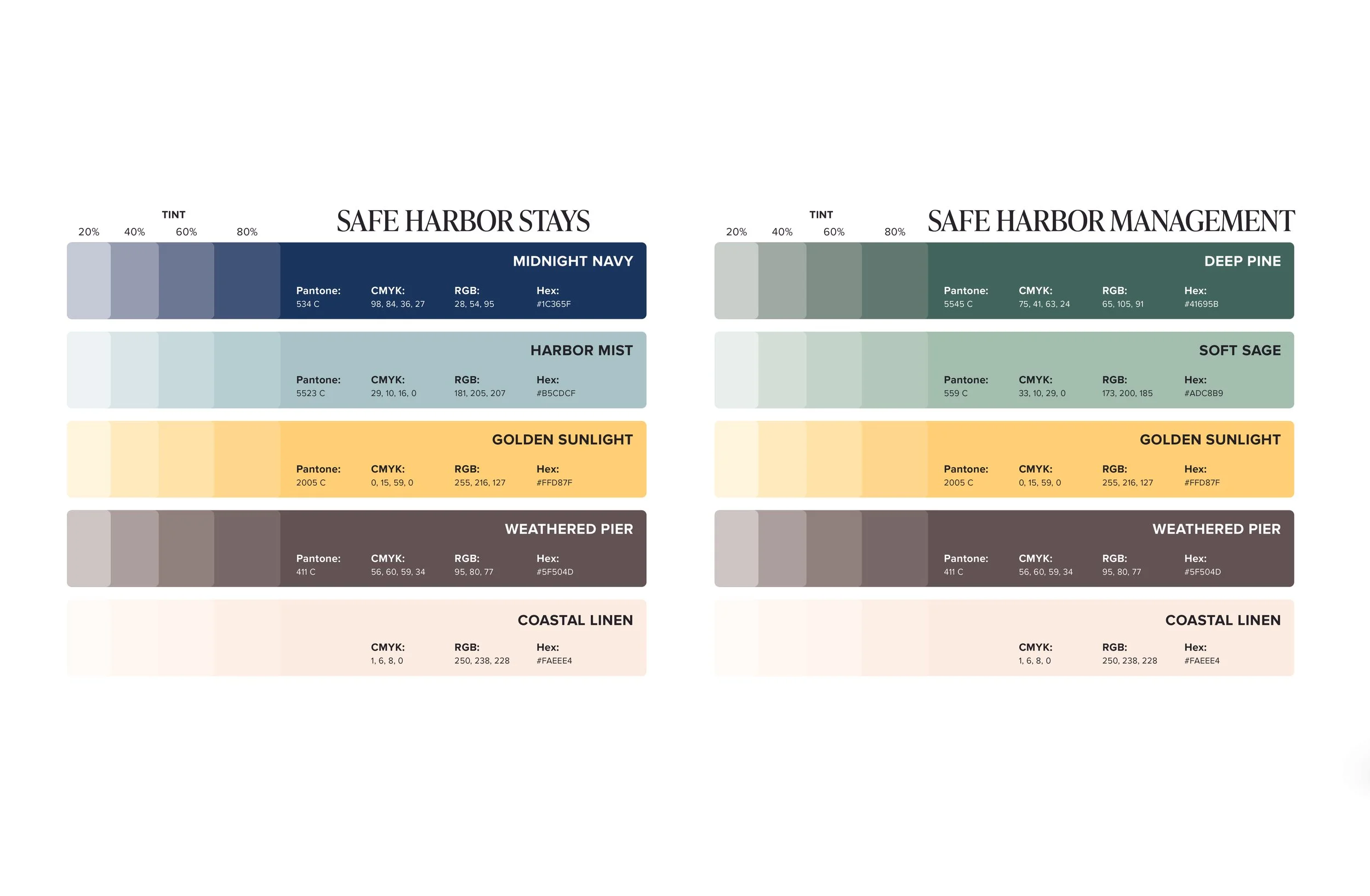
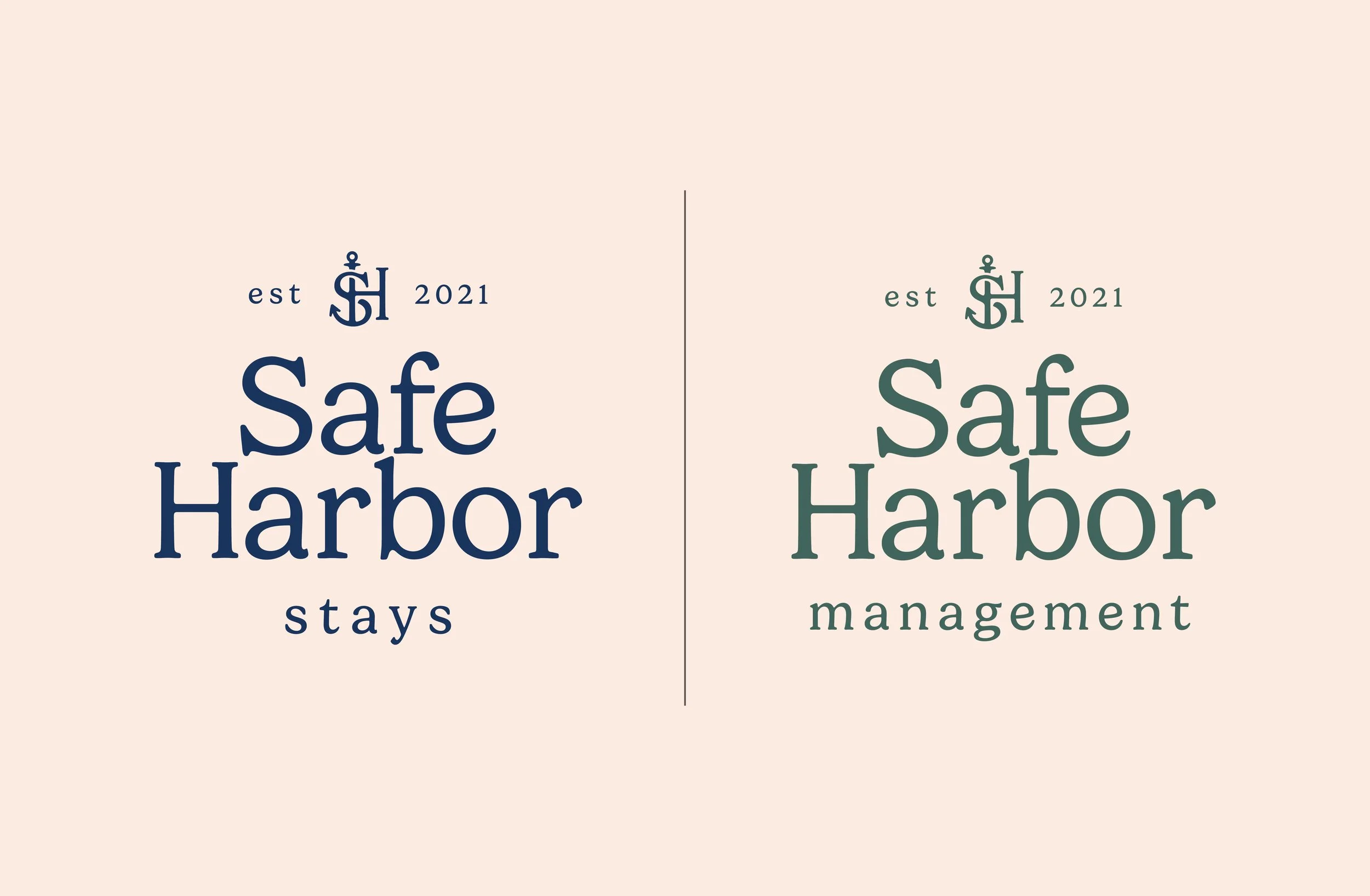
The business is split into two sister brands – Safe Harbor Stays and Safe Harbor Management. Safe Harbor Management is the client-facing side of the business and revolves around managing the client properties. Safe Harbor Stays is for the guests and revolves around advertising the listings and booking guest stays.
The final identity for Safe Harbor Stays and Management is soft and welcoming. It reflects the peace and rest their guests can expect to feel when they choose to stay at their places. Safe Harbor Stays is built around the belief that everyone deserves a place of refuge. Just as a harbor shelters ships from the wind and waves, our spaces are designed to offer calm after life’s storms — a place to anchor, to rest, and to remember what matters. This inspired the anchor icon within the identity system`.